School of Architecture, RMIT University
By Sage Ardona
As a first-timer to anything related to RMIT, this was my first encounter with Sean Godsell’s Design Hub. I’d heard plenty about it, and it’s where the work from first year through to fifth year, final semester, or “Major Project,” is on show over several levels. This was also my first encounter with how students across this institution draw, model, render, or, more broadly, represent their projects.

RMIT Design Hub façade. Photo: Sage Ardona.
The building is impressive, contrasting sharply with its surroundings, but I got lost finding my way in, even with the crowd gathering around the block. I eventually entered from the entrance to the south—oddly positioned directly in front of a traffic crossing—and only realised later that there was another entry much closer to my tram stop. Stair access to the upper levels appeared blocked, leaving three elevators to manage the busy crowd on opening night. Wait times stretched uncomfortably long, instilling a feeling of waiting for something that might not arrive at all.
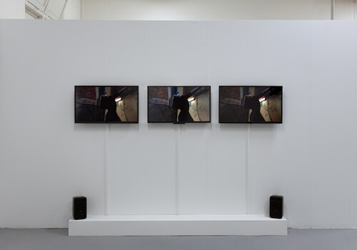
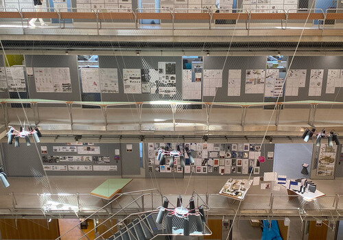
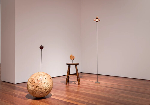
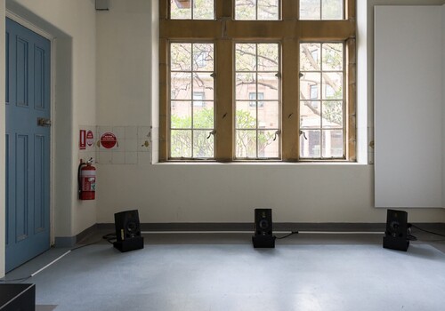
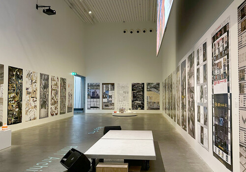
A lift finally arrived, and I reached Level 7. An impressive range of Design Studio projects is on display in a loop-like layout that guides you around curated arrangements of drawings, renders, artefacts, and DJs. Almost all Design Studios incorporate evocative digital renders; they may even have been the most dominant form of representation I spotted as I moved through the building. After another trip back to a lift, this became even more pronounced on Level 2, in the Design Hub Gallery. Here, where the Major Project work is on display, perspectival digital renderings were particularly foregrounded and favoured. Orthographic line-work drawings and physical scale models are present but only minimally, overshadowed by the representations printed and consistently arranged on the gallery’s walls.

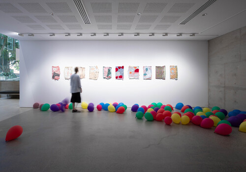
Major Project work on display, Level 2. Photo: Sage Ardona.

Major Project work on display, Level 2. Photo: Sage Ardona.
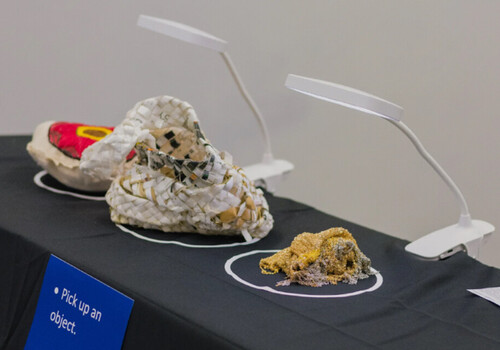
Each student is allocated space for a vertical printed banner. Alongside some banners, free-standing monitors loop slideshows of images and further perspectival renderings. While these banners were individually striking, the abundance and consistency of their forms of representation created a paradoxical sameness, making projects with different agendas and intentions appear oddly adjacent. This raises the question of what difference is legible when so much difference is presented through similar forms of representation?
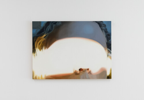
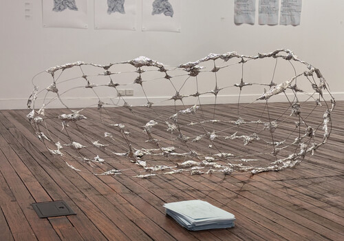
I found myself gravitating toward work with fewer or less dominant rendered perspectives. In contrast to the immersive, atmospheric, image-dominated banners surrounding them, these felt most curious in this show. In Louis Untu’s The Space Between Us, isometric linework drawings dominate, with interior renders serving as secondary aids to show activity and inhabitation. Before I read the pinned information, the project’s intention was evident from the banner alone. The project explores various student living and lounging spaces that reveal the interior systems at play, addressing themes of spontaneous social interaction and meaningful exchange among student residents. The exploded isometric drawings represent the project’s parts as isolated but related by what is between them, rather than consolidating and arranging the proposal’s parts in perspective around a vanishing point.

The Space Between Us by Louis Untu. Photo: Sage Ardona

The Space Between Us by Louis Untu. Photo: Sage Ardona
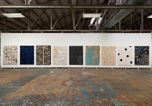
Nicholas Philio’s For Good takes a different direction in resisting a perspectival organisation by being dominated by a plan oblique drawing. Set in Ballarat, the project explores the relationship between old and new buildings, visualising ten city blocks and how they communicate and interact with one another—how “permanence and change are not opposites, but partners in the making of a resilient city,” in Philio’s words. The colourful banner, while constructed differently from most banners, still has an immersive poster-like quality. This is not the same as a collection of orthographic plans and sections that comprise a set of drawings to piece together a proposed project, as one may see at another end-of-semester show.

For Good by Nicholas Philio. Photo: Sage Ardona.

For Good by Nicholas Philio. Photo: Sage Ardona.
This brings me to a few unresolved questions: how different are an image and a drawing? How different is an architectural exhibition that has different balances of architectural images and architectural drawings? Can certain balances in how we represent projects blur the very edges of difference these representations take as their subject matter?
Sage Ardona is an architecture student and emerging writer in Naarm/Melbourne, interested in multidisciplinary approaches. He is currently studying architecture at Monash University.